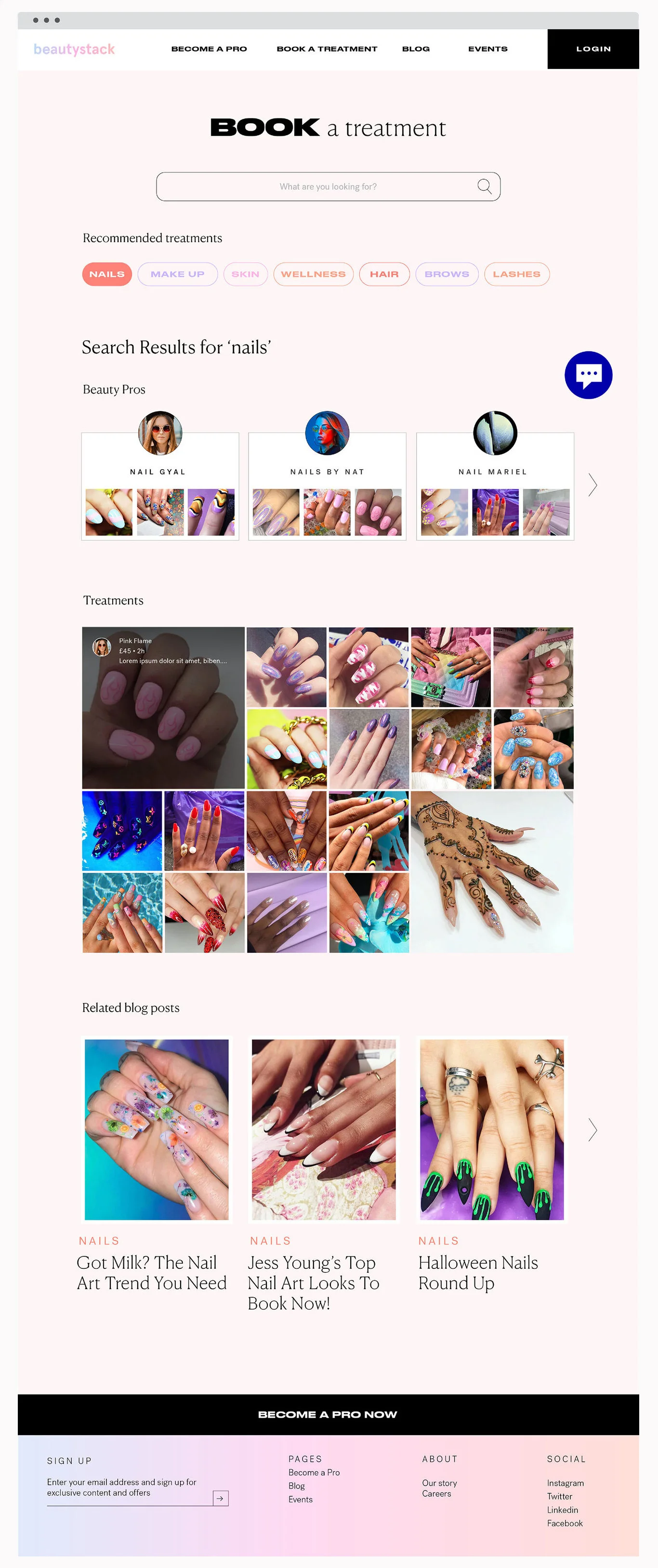
Beautystack.com Relaunch
Knowing we needed to improve the experience for new users on Beautystack, I led sessions to create a user journey map for our Beauty Professionals (supply). Following this, we identified the Beautystack.com marketing website as a weak link in our Beauty Pro's user journey. It comes top of a Google search and is linked across all socials, but did not sufficiently explain what Beautystack is, how it works and the key benefits.
We identified key pain points in the user’s discovery and research phase that caused multiple issues throughout the Pro's journey. Key questions remained unanswered until after a Pro was approved on the app. Often, Pros were signing up without all the information needed, resulting in wasted time for both the Beautystack community team and the user.
In building and designing a comprehensive new website, we eliminated the risk of confusion among our users, whilst also making sure that every prospective Pro using Beautystack is well-informed on the product, and excited to be a part of the brand.
Scope included:
Creation of a user journey map to identify key pain points
Feature report for scope and tech notes
Site map
Content planning and creation
Writing all copy
Support with design process and development
Website launch
User testing


